Exploratory Data Analysis (EDA) of IT Professionals
Tools: Jupiter Notebook | Python: Pandas | NumPy | Matplotlib | Seaborn | SciPy
Introduction
This Exploratory Data Analysis (EDA) project examines compensation, skills, demographics, and work patterns among IT professionals. Using a cleaned, annualized-salary dataset filtered for full-time, USD-denominated responses and with multi-valued fields (e.g., programming languages) normalized, the analysis aims to reveal actionable insights for hiring managers, data practitioners, and professionals planning career moves.
Objectives
- Identify the most popular programming languages among IT professionals.
- Analyze average salaries and key income statistics (mean, median, percentiles, dispersion).
- Explore age distribution and demographic patterns across the workforce.
- Provide statistical summaries of working hours for part-time and full-time professionals.
- Examine relationships between income and factors such as working hours, age, education, experience, role, and skills.
- Determine the most popular databases used by IT professionals.
Methodology
- Descriptive statistics: compute counts, mean, median, standard deviation, IQR, and percentiles for numeric variables.
- Frequency analysis: rank programming languages and databases by prevalence; report counts and proportions.
- Distributional analysis: histograms, density plots, and boxplots for salaries, ages, and working hours; stratify by role, employment type, and region.
- Comparative analysis: group-by and pivot tables to compare median/mean salaries across categories (language, database, education level, role).
- Correlation & modeling: correlation matrices and scatterplots to inspect linear relationships; regression or tree-based models to quantify the effect of predictors (hours, age, education, skills) on income, controlling for confounders.
- Statistical testing: ANOVA or non-parametric equivalents to test salary differences across groups; significance thresholds and effect size reporting.
- Visualization & dashboarding: interactive plots and filters to enable drill-downs (by location, experience, role, language, database).
Expected Insights
- Top programming languages and databases used across the industry.
- Typical compensation ranges and which skills, roles, or demographics associate with higher pay.
- How age and working hours correlate with income and career stage.
- Evidence-based recommendations for skill development, hiring priorities, and compensation benchmarking.
Dataset:
Our data set is a survey works among IT professional , collected and published in the link below.
“https://api.example.com/data”
It has 11551 records and 84 columns. (11552, 85)
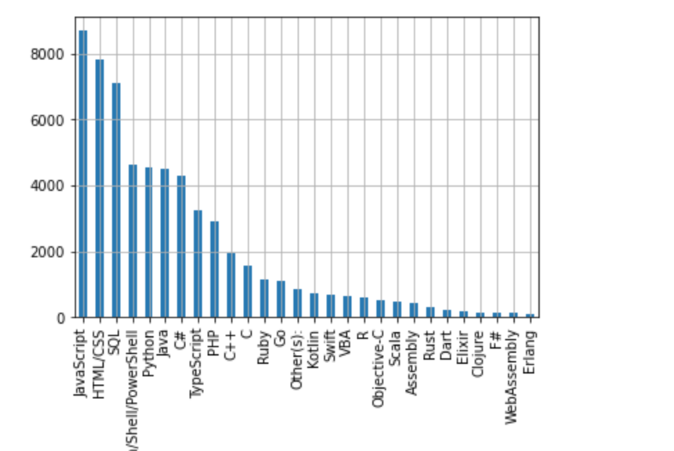
1. Identify the most popular programming languages among IT professionals.
There are unique 28 programming languages , the top most popular ones are:
- JavaScript
- HTML/CSS
- SQL
- Bash/Shell/PowerShell
- Python
2. Analyze earning among IT professionals.
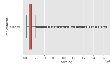
count 3,125.00
mean 152,928.26
std 207,792.90
min 38,272.00
25% 84,000.00
50% 106,000.00
75% 140,000.00
max 1,664,000.00
1. Central Tendency (The “Middle”)
- Mean (152,928.26): The arithmetic average of all values.
- 50% / Median (106,000.00): The exact middle value when the data is sorted.
- Interpretation: Because the mean is much higher than the median, your data is right-skewed (positively skewed). This typically occurs when a few very large values pull the average up, while most data points remain lower.
2. Spread and Variability
- Std (Standard Deviation: 207,792.90): This measures how far, on average, data points are from the mean. A standard deviation larger than the mean itself indicates extremely high variability and inconsistency.
- Min (38,272.00) & Max (1,664,000.00): These define the total range. The massive gap between the max and the 75th percentile (140k vs. 1.66M) confirms the presence of significant outliers at the high end.
3. Distribution Percentiles (Quartiles)
- 25% (84,000.00): One-quarter of your data is below this value.
- 75% (140,000.00): Three-quarters of your data is below this value, meaning the top 25% of your data starts at 140,000.
- Interquartile Range (IQR): The middle 50% of data falls between 84,000 and 140,000.
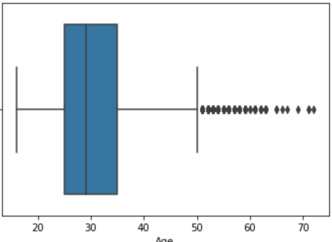
3. Explore the age distribution among IT professionals.
Summary statistics.
- Mean: 30.77
- Std (standard deviation): 7.37
- Min: 16.00
- 25% (first quartile, Q1): 25.00
- 50% (median, Q2): 29.00
- Max: 72.00
- 75% (third quartile, Q3): 35.00
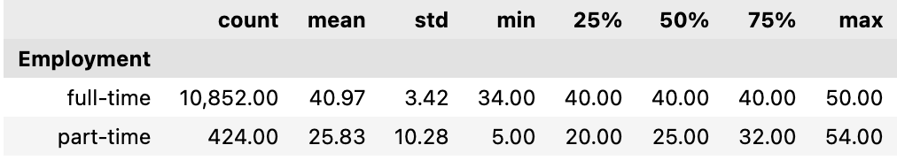
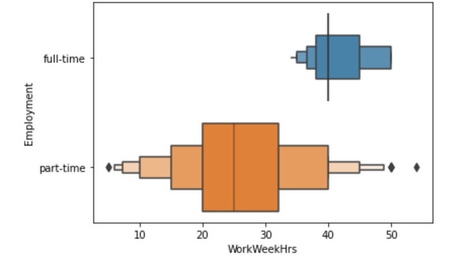
4. Provide statistical information on working hours for part-time and full-time IT professionals.
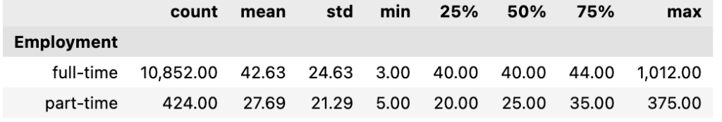
Reading into dataset:
The Max of 1,012.00 hours is mathematically impossible (there are only 168 hours in a week). This indicates “noisy” data or data entry errors in the dataset.
Similar to the full-time data, the Max of 375.00 hours is impossible for a single week, suggesting errors in the source data.
Full-time workers are a much larger group in this data and center strictly around a 40-hour week. Part-time workers have a much broader distribution relative to their average, typically working between 20 and 35 hours.
After applying outlier treatment:
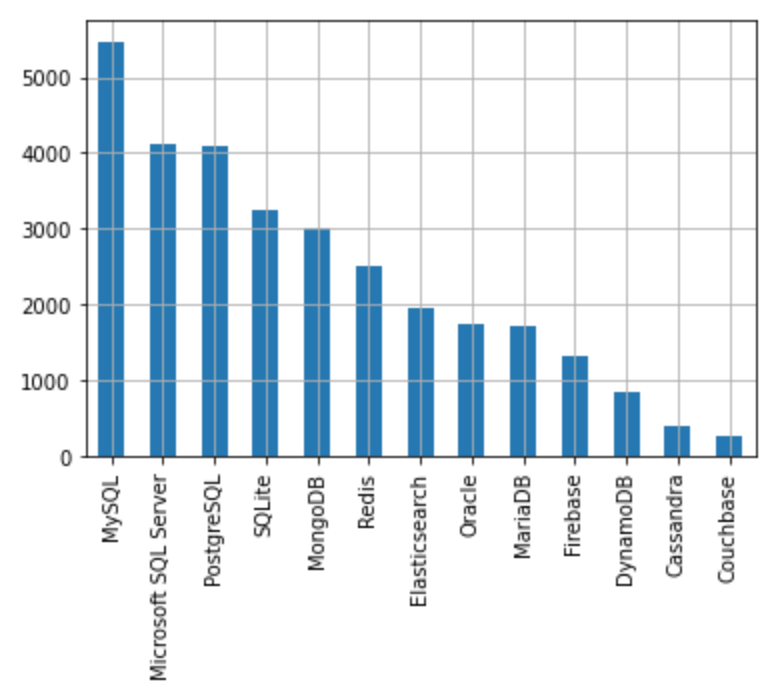
5. Determine the most popular databases among IT professionals.
There are 13 unique databases , the top most popular ones are:
MySQL
Microsoft SQL Server
PostgreSQL
SQLite
MongoDB
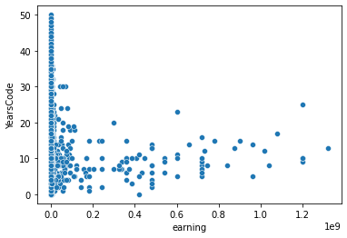
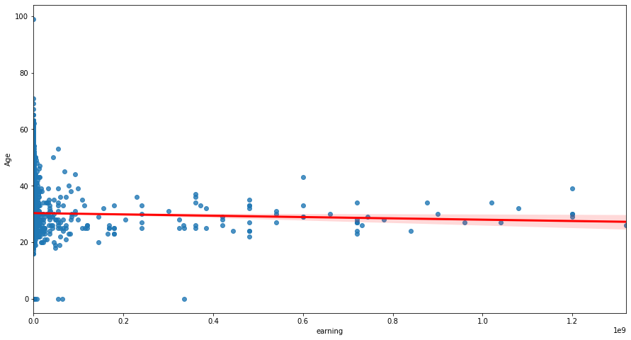
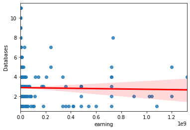
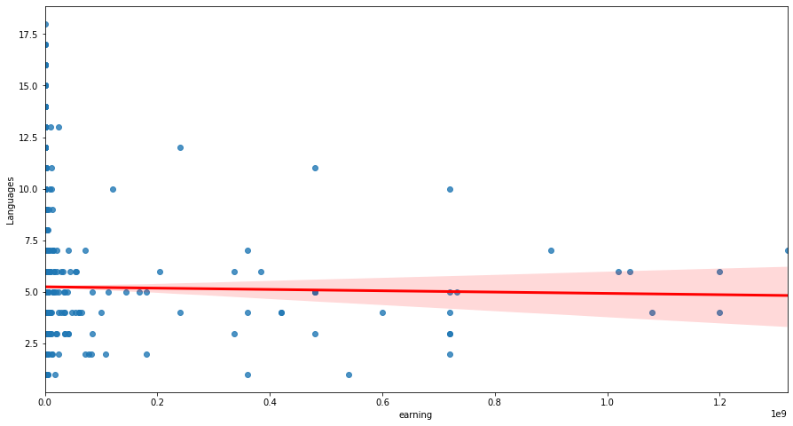
6. Examine the relationship between income and various factors such as working hours, age, education, and other variables.
Top 3 Insights From the Pair Plot Below:
- Experience Variables Are Strongly Correlated
- YearsCode, YearsCodePro, and Age move together in clear linear patterns.
- This confirms that experience‑related fields are consistent and reinforce each other.
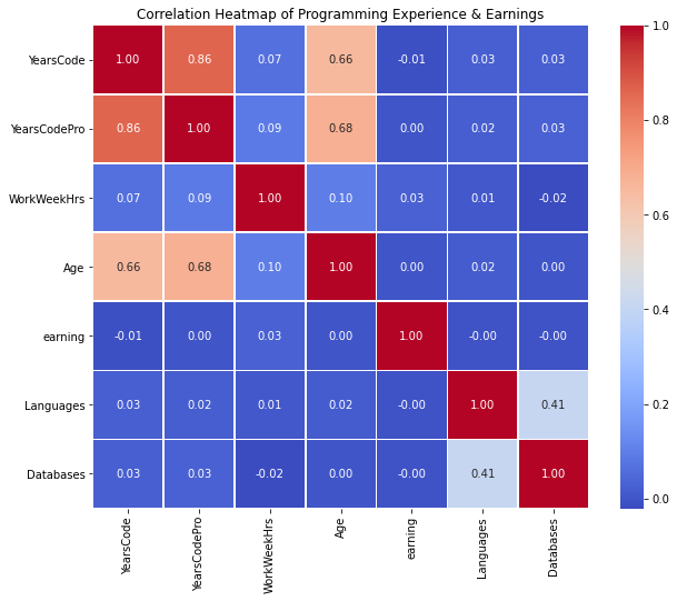
- Compensation Shows Only a Weak Positive Trend With Experience
- CompTotal increases slightly with YearsCodePro, but the scatter is wide.
- This suggests compensation is influenced by many external factors (role, region, company size), not just experience.
- Insight: experience alone is not a strong predictor of pay.
- Tool Knowledge Grows Slowly With Experience
- Languages and Databases show mild upward trends with experience.
- Most respondents know only a few tools, with a small number of outliers.
- This indicates that tool count is not a strong differentiator across the population.
For Categorical Variables like Ethnicity , Country, Education , Gender and more we can use Chi-Square test to determine if there is a statistically significant association between two categorical variables.